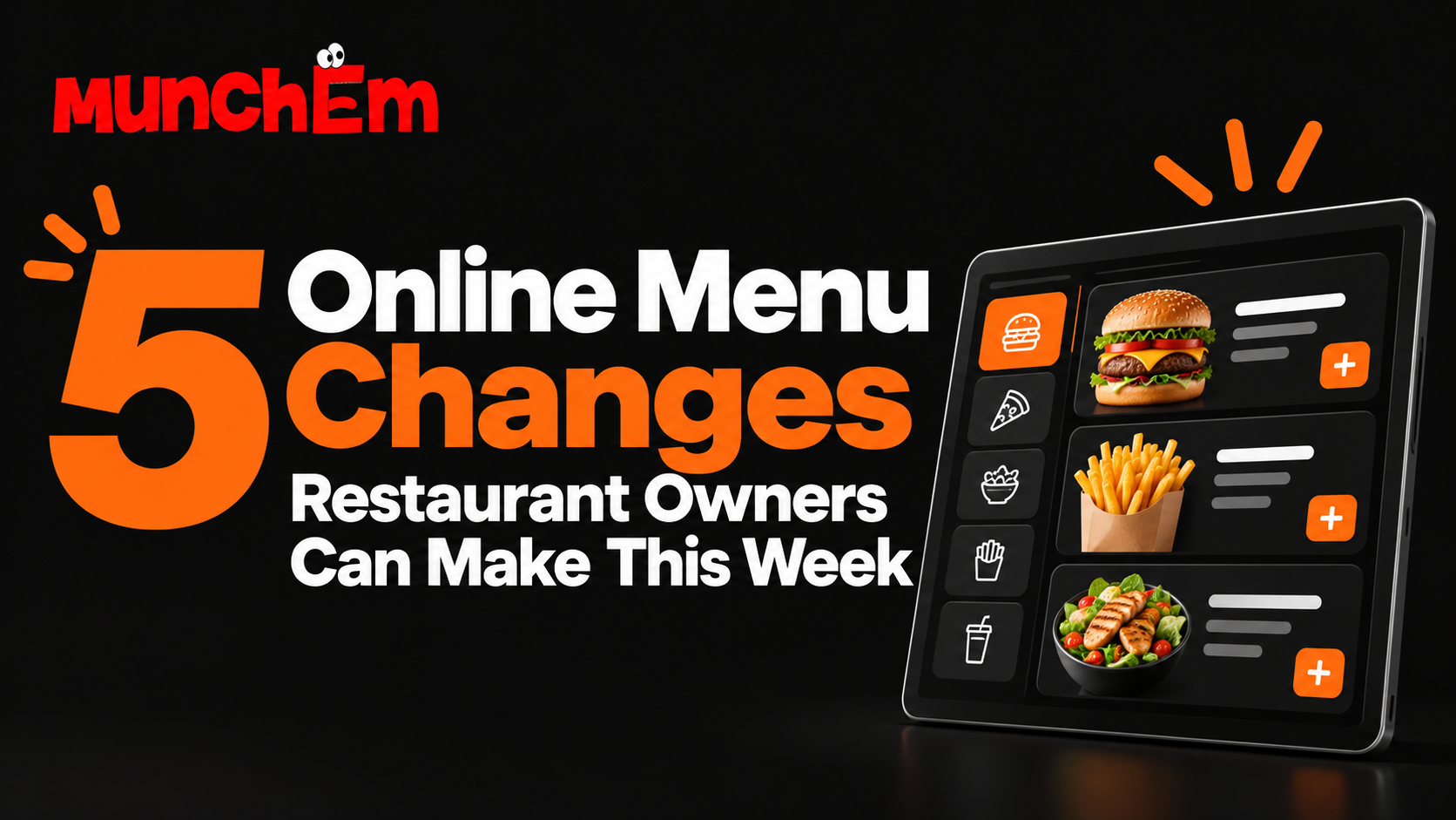
Your online menu is more than a list of items. It directly affects how quickly customers decide what to order, how much they spend, and whether they complete the order at all.
The good news is that improving an online menu does not always require a full redesign. A few practical changes can make the ordering experience clearer, faster, and more effective.
Here are five updates restaurant owners can make this week.
1. Put Your Best Sellers Where Customers See Them First
Customers should not have to search for the items they are most likely to order.
Start by identifying your most popular dishes, highest-margin items, or strongest signature products. Then make sure they appear near the top of the relevant category.
For example, if your top-selling burger is buried halfway down a long list, move it closer to the top. If a family meal performs well, make it easier to find without forcing customers to scroll.
You can also use simple labels such as:
- Popular
- Best Seller
- Customer Favorite
- Chef’s Pick
Keep the number of highlighted items limited. If everything is marked as special, nothing stands out.
The goal is to help customers make decisions faster by showing them proven choices first.
2. Simplify Category Names and Menu Structure
A confusing menu slows customers down.
Categories should be clear and familiar. Avoid overly creative names that make customers guess what is inside.
“Burgers,” “Pizzas,” “Sides,” “Drinks,” and “Desserts” are easier to understand than vague categories that require extra thought.
You should also look at the number of categories.
If your menu has too many sections, it may feel harder to navigate. Some categories can often be combined.
For example, “Cold Drinks,” “Soft Drinks,” and “Beverages” may not need to be separate unless there is a clear reason.
A cleaner structure helps customers move through the menu with less friction. It also makes mobile ordering easier, where screen space is limited.
3. Improve Item Names and Descriptions
Customers cannot ask questions as easily when ordering online, so your menu has to do more of the explaining.
Item names should be easy to understand. Descriptions should answer the most important questions without becoming too long.
A good description might include:
- Main ingredients
- Cooking style
- Portion or size
- Important choices
- What comes with the item
For example, instead of:
Chicken Sandwich
Try:
Grilled Chicken Sandwich
Grilled chicken breast, lettuce, tomato, pickles, and house sauce on a toasted bun.
That gives the customer enough information to make a decision quickly.
Avoid descriptions filled with unnecessary adjectives. Clear information usually works better than overly promotional wording.
4. Add Better Upsell Options
Your online menu should make it easy for customers to add something useful to their order.
Look at each major item and ask: what naturally goes with this?
For a burger, that might be fries or a drink.
For pizza, it might be wings, garlic bread, or soda.
For an entrée, it could be a side, dessert, or upgraded protein.
These suggestions can appear as modifiers, recommended add-ons, or prompts before checkout.
The important part is relevance.
Do not show customers random extras just because they are available. The best upsells feel helpful.
You should also make upgrade choices simple. If customers can increase the size, add a topping, or choose a premium side, show the price difference clearly.
Even small add-ons can raise average order value when they are presented consistently.
5. Remove Anything That Creates Confusion
Sometimes the best menu improvement is removing things.
Review your online menu as if you were a first-time customer.
Look for:
- Duplicate items
- Outdated products
- Old prices
- Unclear modifiers
- Long option lists
- Items that are often unavailable
- Categories with only one item
- Confusing instructions
Every unnecessary choice creates friction.
A modifier with 20 options may look flexible, but it can also overwhelm customers. If several options are rarely used, consider simplifying the list.
Also check whether the same item appears in multiple places with slightly different names or prices. Inconsistency can make customers question whether the menu is accurate.
A weekly menu review can prevent small issues from building up.
Bonus: Check the Menu on a Phone
Many customers place online orders from their phones, so do not review your menu only on a desktop computer.
Open it on a phone and go through the entire ordering process.
Ask yourself:
Can I find the main categories quickly?
Are the item names readable?
Do descriptions fit well on the screen?
Are buttons easy to tap?
Are modifiers clear?
Does checkout feel simple?
A menu that looks fine on a large screen may feel slow or cluttered on mobile.
Testing the customer experience yourself is one of the easiest ways to find problems.
Small Menu Changes Can Make a Big Difference
You do not need to rebuild your entire online ordering system to improve results.
Start with five simple steps: move your best sellers up, simplify categories, improve descriptions, add relevant upsells, and remove confusing choices.
Then test the entire menu on a phone.
A clearer menu can help customers order faster, discover more items, and complete their purchases with less frustration.
Want an easier way to manage your restaurant’s online menu and ordering experience? See how MunchEm can help.